Food packaging today is more than a container. It’s often the deciding factor in whether a shopper takes a product home or leaves it on the shelf.
In a market full of choices, buyers don’t just want food; they want a product that feels trustworthy, appealing, and aligned with their lifestyle.
That’s why packaging design has become one of the strongest marketing tools a brand can invest in.
Below are ten unique approaches to food packaging that have proven to spark curiosity, build trust, and ultimately drive sales.
1. First Impressions Are Everything
When people walk into a store or scroll through an online shop, the very first thing that grabs their eye is the package.
Long before taste comes into play, design sets expectations. If a product looks premium, safe, or playful, that impression lingers.
Successful brands understand that packaging is silent communication.
A matte finish can feel sophisticated, while a glossy wrapper conveys energy and fun. Embossed lettering, foil accents, or transparent panels all contribute to that crucial first glance.
Getting this moment right often means the difference between being overlooked and being chosen.
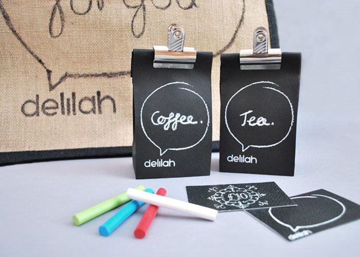
2. Small Touches That Add Big Personality
Not every design shift requires a full rebrand. Sometimes it’s the smallest creative detail that makes a product stand out. A hand-drawn doodle on the label, a quirky color stripe, or even seasonal accents can give packaging an approachable, human feel.
One clever option many brands lean on is washi tape. This decorative tape can seal boxes, wrap jars, or add playful accents to standard packaging. It’s cost-effective, flexible for limited editions, and creates a handcrafted look that resonates with customers who value authenticity.
By layering in small touches like this, brands show care without overspending, proving that creativity doesn’t have to mean extravagance.
3. The Power of Minimalism
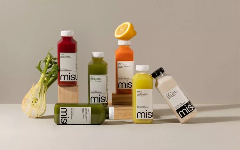
Minimalist design works precisely because it refuses to compete for attention with loudness. Instead, it invites buyers to pause. Neutral color palettes, clean typography, and uncluttered layouts create a sense of calm and order.
Health-conscious and luxury food products often thrive with this approach. It signals honesty and quality, leaving room for the product itself to take center stage. In a crowded aisle, simplicity often stands out more than complexity.
4. Sustainability as a Selling Point
More consumers now weigh packaging sustainability in their purchase decisions. This means materials are as important as visuals.
Brands adopting compostable wrappers, recycled paper, or biodegradable plastics not only help the planet but also earn loyalty.
Shoppers respond strongly to packaging that reflects shared values. A small stamp indicating recyclability or a short note about eco-friendly sourcing can tilt the balance.
Here, form meets function, and customers feel they are contributing to something larger than a single purchase.
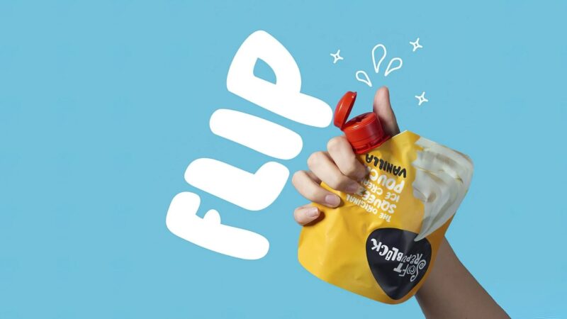
5. Packaging That Invites Interaction
Sometimes packaging becomes part of the experience itself. Interactive elements add fun and value, turning the box into more than just protection.
A few approaches that work particularly well include:
- Recipe cards tucked into pasta or spice packages.
- Collectible panels on snack boxes that encourage repeat purchases.
- QR codes leading to videos or trivia for kids.
These touches give products a second life and create reasons for customers to engage beyond the initial buy.
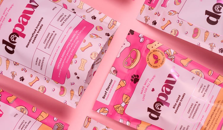
6. Storytelling Through Design
Illustrations and visual storytelling connect people to the origins of their food. A bag of beans printed with sketches of the farm, or chocolate bars wrapped in maps of cocoa regions, communicates heritage and authenticity.
This isn’t about decoration for its own sake. When buyers see a story in the packaging, they feel closer to the product.
It builds emotional value that makes the food feel more than just an item—it becomes part of a narrative they want to support.
7. Transparency Builds Confidence
Few things reassure customers more than being able to see what they’re buying. Transparent windows on packaging – whether for cookies, nuts, or fresh bread – give instant credibility.
Clear panels let buyers judge quality at a glance, while also creating appetite appeal. After all, what’s more convincing than the product itself looking fresh and delicious inside the package?
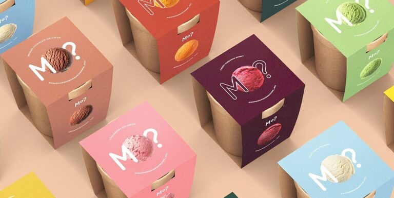
8. Bold Typography That Commands Attention
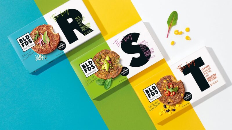
Sometimes words themselves become the design. Oversized lettering, unique fonts, and striking placement can stop shoppers mid-step. Typography works best when it embodies the brand’s personality:
- Serif fonts give tradition and heritage.
- Sans-serif fonts communicate modern clarity.
- Handwritten styles add warmth and playfulness.
Typography-driven packaging works because it feels both simple and confident, making the product appear proud of what it offers.
9. Limited Editions That Create Urgency
When packaging is designed for a limited run—seasonal themes, artist collaborations, or special flavors—it creates urgency. People buy not only for the product but also for the experience of owning something temporary.
This strategy often sparks social media buzz. Shoppers share photos of “exclusive” packaging, helping small brands generate word-of-mouth marketing at minimal cost. Limited editions also allow brands to experiment without committing to permanent changes.
10. Structural Designs That Redefine Convenience
Shape is often overlooked, but it has enormous impact. Triangular cartons, resealable snack bags that double as serving bowls, or stackable tins make life easier for customers while catching their attention.
A clever structural twist combines two benefits: functional convenience and visual novelty. Customers may not consciously analyze why they prefer one product’s shape over another, but they’ll remember how simple it made their experience.
Why Thoughtful Packaging Wins
At the end of the day, food packaging design is not just aesthetics. It’s a silent ambassador for the brand. Buyers respond to creativity that feels intentional, whether it’s sustainable materials, bold typography, or the small joy of peeling off a strip of washi tape.
The best packaging balances function with emotion, giving people reasons to feel good about their choice. In a marketplace where attention is fleeting, design is the one tool that keeps customers coming back.